ShmoopTube
Where Monty Python meets your 10th grade teacher.
Search Thousands of Shmoop Videos
Scatterplots Videos 9 videos
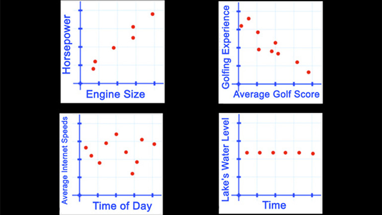
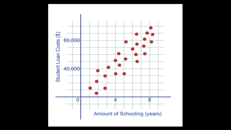
Statistics, Data, and Probability II Drill 4 Problem 1. Which of the following scatter plots represents a negative correlation between the data sets?
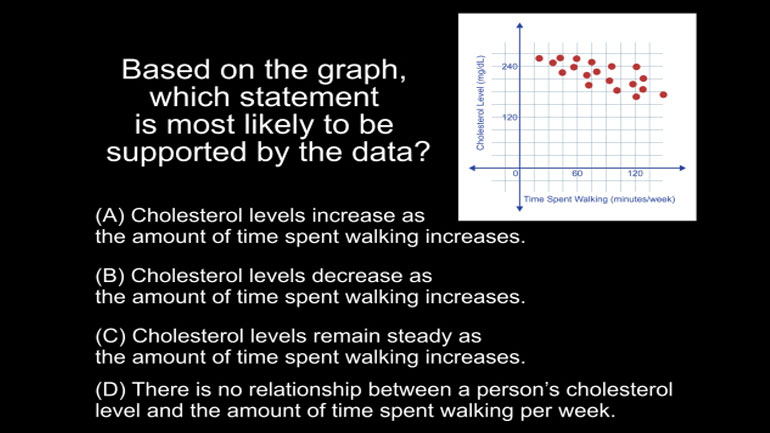
Statistics, Data, and Probability II Drill 4 Problem 2. Based on the graph, which statement is most likely to be supported by the data?
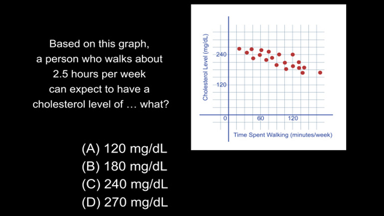
Statistics, Data, and Probability II Drill 4 Problem 3. Based on this graph, a person who walks about 2.5 hours per week can expect to have a...
CAHSEE Math 4.2 Statistics, Data, and Probability II 207 Views
Share It!
Description:
Statistics, Data, and Probability II Drill 4 Problem 2. Based on the graph, which statement is most likely to be supported by the data?
- Statistics and Probability / Summarize, represent, and interpret data on two variables
- Statistics and Probability / Summarize, represent, and interpret data on two variables
- Statistics and Probability / Understand and evaluate random processes underlying statistical experiments
- Statistics and Probability / Make inferences and justify conclusions from sample surveys, experiments, and observational studies
- Statistics and Probability / Summarize, represent, and interpret data on two variables
- Statistics and Probability / Summarize, represent, and interpret data on two variables
- Statistics and Probability / Summarize, represent, and interpret data on two variables
- Statistics and Probability / Understand and evaluate random processes underlying statistical experiments
- Statistics and Probability / Make inferences and justify conclusions
- Statistics, Data Analysis, and Probability 7 / Scatterplots
Transcript
- 00:03
One shmoop or two?
- 00:05
The following graph shows points representing the relationship between the amount of time
- 00:09
spent walking per week and cholesterol levels of various people.
- 00:13
It’s also a pretty good diagram of what the red blood cells look
- 00:16
like in those higher-cholesterol people…
Full Transcript
- 00:18
Based on the graph, which statement is most likely to be supported by the data?
- 00:23
And here are the potential answers...
- 00:32
Can we read a scatter plot? Well, that’s what it's asking anyway.
- 00:37
Let’s go through the potential answers one by one.
- 00:41
So A says “Cholesterol levels increase as the amount of time spent walking increases.”
- 00:47
Well...if A were to be true, the dots would follow this kind of line like from the
- 00:51
origin up and to the right about a 45 degree angle –
- 00:55
yet here, we don’t see that at all… so A is false.
- 00:59
B. “Cholesterol levels decrease as the amount of time spent walking increases.”
- 01:03
Well B is sorta true – yes, they do decrease but not dramatically.
- 01:07
We’re looking for the BEST answer here so let’s keep reading.
- 01:11
C. “Cholesterol levels remain steady as the amount of time spent walking increases.”
- 01:17
Hm – no – they definitely decline – just not all that much. So C is definitely false.
- 01:23
OK… D. “There is no relationship between a person's cholesterol level and the amount
- 01:27
of time spent walking per week.”
- 01:29
D might be true… but it looks like there clearly is a pattern here – just not a dramatic one.
- 01:35
If it was dramatic, the line would look like this…
- 01:37
…and, well, our nation’s sidewalks might be more crowded.
- 01:40
But ok, clearly the BEST answer is B.
- 01:43
As in, “Bypass surgery.”
Related Videos
CAHSEE Math: Algebra and Functions Drill 5, Problem 3. Solve the equation.
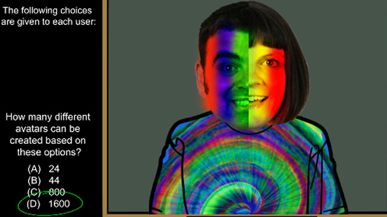
Statistics, Data, and Probability I: Drill Set 3, Problem 4. How many different avatars can be created based on the given options?
Statistics, Data, and Probability II Drill 3 Problem 2. Which two sports together make up for the preferences of more than half of all those w...
Statistics, Data, and Probability II Drill 3 Problem 3. One hundred twenty of those who were asked preferred what sport?
